The strongest logos tell simple stories.
Sol Sanders
American Brand Shaper
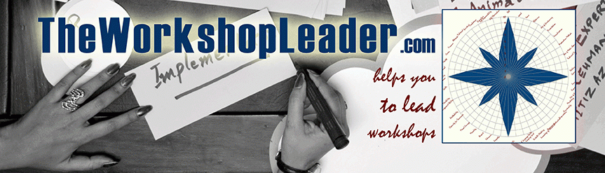
What looks from afar like a compass rose is the Wheel of Competence, which I have developed for moderators and trainers. The TWL logo is a radar diagram of an assessment scale, which allows you to (self-)detect your areas of improvement towards a perfect workshop leader. In this case it was filled with random values. The TWL logo stands for enabling you to learn and become aware of your strengths and weaknesses as workshop leader and to work on them. This, it gives like a compass rose orientation and direction for further developlement of your key competences. In other words: Be aware where you stand today and go in the best possible direction tomorrow.
In 2020 I’ve updated the logo to a better visible and more modern design. The basic idea of a leader giving orientation expressed by a wind rose on one hand and on the other hand of progress by constant development based on the Wheel of Competence remains.
TWL logo as Leadership symbol
Moreover, the TWL logo stands for understanding of leadership. In general terms a leader gives orientation. He or she knows the true north. The leader will focus on a goal. With the help of a compass he will derive the degree number to follow. From the starting point on the leader will accompany the group and help in overcoming obstacles. Thus the group will achieve its objective and finally say “we did it” – often unaware that it was the leader who brought them there.
What the Fonts stand for
As part of the corporate design TheWorkshopLeader.com uses three fonts:
The basic text font is Avenir Next, which is often not always be visible depending on your browser. The type designer Adrian Frutiger intended to have a “more organic interpretation of geometric style”. While designing in 1987 he had “always the human nature in mind”. Consequently, it’s an individual style suitable for extended texts.
Headings are kept in Haettenschweller. This is a strong impact font representing strong impacts leaders have. They are often bold. The stand out and are remembered. The same goes for content in disfluent (or ugly fonts if you want): A 2010 study of Princeton University found that readers retained more information, when text is written in these kinds of fonts. The German designer Walter Haettenschweller published in 1954. Ever since it has been imitated, but I prefer to stick to the original.
Around the same time the French Roger Excoffon developed the handwriting font Mistral, which stands for individuality of leaders and personalized support according to each person’s needs. Mistral is also the name of a wind in southern France after which the designer named the typographer version of his own handwriting.