If you change the way you look at things, the things you look at change.
Dr Wayne Dyer (1940–2015)
US author and motivational speaker
An image is the best way to get your idea into the head of your audience. Neurons start firing when a participant has a Eureka moment! Even if the image depicts the same thing as the text it accompanies, this allows you to achieve a ‘double coding’ of the same information. The memory will work more reliably if it has two tracks to follow later on.
There is no objectively good visualization or image. It always depends on your target audience and your message. The basic question is, ‘What do I want to tell to whom?’
Purpose of Visualizations
The purpose of visuals depends very much on the target audience. What are the viewer’s expectations and experiences? For example, many people could not say what was wrong with this picture on the right.
The only participants who could explain the problem are those who have been to Germany: there is a hydrant on a mailbox! In order to be able to interpret the image, a German mailbox and a hydrant must be part of your visual experience. On the other hand Germans could not identify the person in this photo (bottom left) when I posted it on Facebook, while it was easy for every Pakistani where I had taken the picture. It is not part of an average German’s visual experience that a person would wear this type of clothes and sit on the top of a truck.
Furthermore, everybody will see something different in the same image. This depends on an individual’s attitude. So, when you include an image, the outcome could differ from your original intention.
Finally, a visualization depends on the context you present it in. Be aware of this pitfall!
Visualizations can have several purposes:
- Understanding by Simplification.
- Learning and Memorizing.
- Motivation (laughter, curiosity, concern etc.).
- Structuring.
- Explanation.
- Guidance of Action.
- Visualize Communication.
- Heuristic / Problem Solving.
If none of the above mentioned applies to the visualization you want use, you should ask yourself what’s the point of using it?
Types of Visualizations
Many types of visualizations exist. Each of them serves a certain purpose. Not all of them are suitable for all audiences. Remember: it’s a case by case decision depending on purpose, context and audience — not to forget your message. So, decide carefully what you want to say to whom!
Hierarchical Structures
Structures visualize relationships. For hierarchical relationships this means mainly management, power or authority. The visualization of these structures — often found in organisations or societies — comprises several levels.
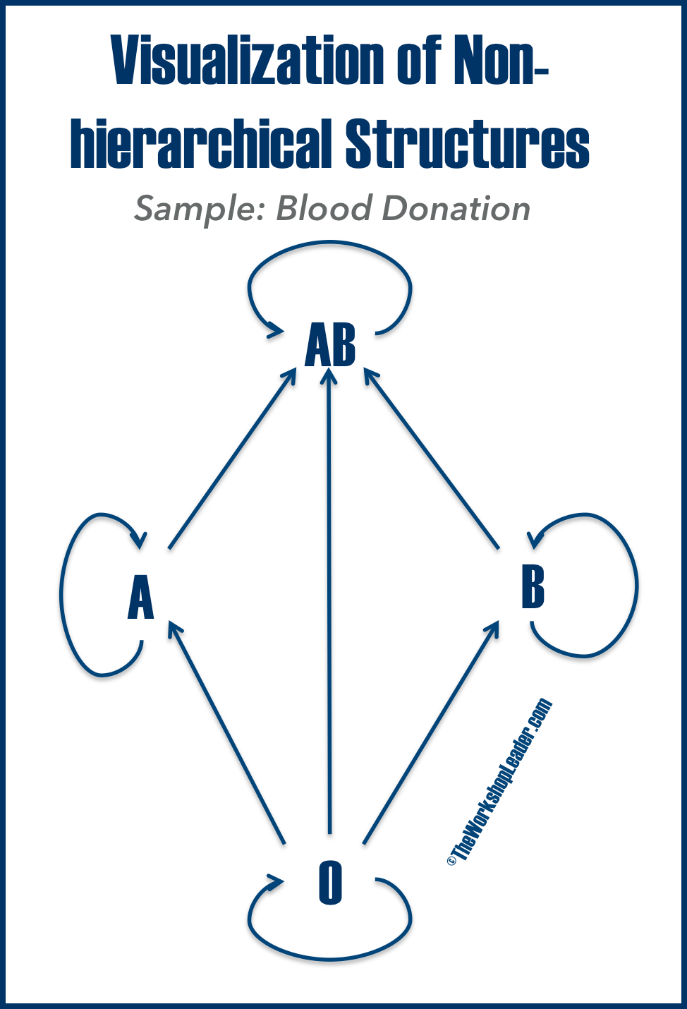
Non-hierarchical Structures
Non-hierarchical structures show relationships, which are not based on power or authority. This can also reflect an (non-hierarchical) organisation, the relationship in a school class or any other kind of relationship. Here is an example from biology:
Who can donate blood to whom?It becomes clear at a glance it’s easy memorisable and easy to understand:
Blood group Zero can give to itself, to A, to B, as well as to AB. While A can donate to itself and to AB, B to itself and AB, while AB only donate to itself.
This illustration is easy to remember and once explained you don’t need the paragraph above for explanation.
MindMap
MindMaps can be presented at once or developed together with an audience. As such they can serve also as a moderation technique. Here just a short sample of the principles of Tony Buzan’s excellent invention. For this MindMap that outlines the roles of a trainer we used the software FreeMind, but in fact you can also use presentation software like Keynote or PowerPoint or just draw it by hand.
Flowchart
You can explain processes much better in a visual way: by using a flowchart. The autodidact Frank Bunker Gilbreth (1868—1924) better known for his book Cheaper by the Dozen) invented this means of describing processes in 1921.
This type of visualization uses the standardised symbols and moves step-by-step through the process. Thus, you can explain what has to be done easily.
Bar Charts
The best-known diagrams are bar charts. At one glance you can compare quantities, almost without any explanation. Because charts produced in Microsoft Excel and similar software can often look quite homogenous, it helps to customise yours. For example, by adding the party flags, you can do without writing their names.
Pie Chart
The best way to express a share of a whole, like here (to the right) seats in parliament.
Doughnut
A doughnut is just a variation of a pie chart. It serves to show a certain share or percentage, in this case participants in a poll.
Radar Diagram
Inspired by a radar screen, a radar diagram (also called web chart or spider chart) can take multiple variables into account as well as multiple information. Here, we put the self-assessment of several moderators according to the TWL Wheel of Competence.
Line Chart
A line chart is best for demonstrating developments, especially in changes over time. It’s often used in business to portray turnover or benefits on a balance sheet as below.
Ishikawa or Fishbone Diagram
The Japanese university professor Kaoru Ishikawa developed an analytical tool for quality management in 1968: the Ishikawa or Fishbone (due to its look) diagram. It is one of the main basic tools of quality control. The diagram takes into account major categories to identify sources of variation — and thus causes of variation of a product or an event. Causes can be derived in brainstorming. It will help you to improve your work.
Images
Like visualizations, images can tell your story or support your message. If this is not the case then just skip the image! There is no point in including an image, which adds nothing.
Reduce the file size of large images before placing them onto slides. Otherwise, there might be a time lag before the picture appears due to the processing time of the computer. Furthermore, it increases your presentation file size and it will be harder to send your presentation as an attachment. Imagine you have ten photos of 2.5 MB each. Your presentation will be more than 25 MB. That is too large to send by e-mail. If you have downsized them to 250 kb the presentation will be a far more manageable 2.5MB.
Also, reduce the content as far as possible. As Robert Capa’s famous axiom goes, ‘Less is More’ and your message will be much stronger.